


Designing my first book cover as a debut author (!!!)
Plus: The covers we *didn't* go with and why

brb, screaming/crying/throwing up because I can FINALLY share not just the official cover design but also the pre-order links for my first book, The LGBTQ+ Travel Guide with Lonely Planet!!!
In honor of this exciting milestone (I don’t think I have never used so many exclamation points in my life!!!) I thought I’d share a little behind-the-scenes look at the cover design process I went through with the brilliant team at Lonely Planet to bring this book's spirit to life.
And as a little bonus for my paid subscribers: some of the alternative cover designs that we considered along the way—each one has its own charm, and I’ll explain why we ultimately chose the one we did.
How it started: The book cover design process
Round 1
I got my first email about the cover from the book’s designer Emily after my completed manuscript had been submitted, in early June. Emily passed along three initial cover design concepts, specifically noting that:
None of these designs were final. They were explorations into three distinct design directions, and once we narrowed down our preferences, she’d further develop them. After this initial stage, she told me, she’d finesse the typography, color palette, layout, and images.
All images in these initial concepts were placeholders. They were simply meant to communicate the general concept and direction of each design. Again, once we narrowed down on a concept, she said, she’d source the final images.
With those notes in mind, Emily asked me to review the designs she’d shared and to answer the following questions:
Which of the directions do you think will resonate most with our target audience and why?
Which of the directions do you think best communicates the concept of the book and why?
My literary agent Maria and I discussed each of the designs at length, identifying what we thought worked well and what we didn’t. Maria encouraged me to consider each design at thumbnail size, too, since that’s how many readers would see it when browsing for books online. We spent a few days finalizing our feedback before sending it back to Emily and my editor Becca at Lonely Planet.
Round 2
After implementing our feedback, along with insights from the sales and marketing team, Emily returned to us about a week later with two revised design concepts to review. She let us know that internally, the sales and marketing were leaning toward concept A, while my agent and I preferred concept B.

Round 3
To try to strike a balance between these opposing preferences, Becca and Emily sent over five final design directions for our review—some revised concepts and some brand new designs she’d come up with.
Becca let us know that she and Emily would need to present one or two covers to the Lonely Planet team within the week, so she asked us to let them know which were our favorite(s) within a few days. She told us that Emily could make some slight adjustments to designs from this final five—things like colors, image swaps, making text more legible, etc.—but that unless we were really not digging any of them, they’d prefer if we made our final decision based on these five directions.
In that last round of reviews, I provided as much detailed feedback as I could, specifying exactly what I did and didn’t love about each of the remaining designs, from font sizes to color choices to image selections and more. I requested that elements from some designs be added to others, mix and matching where it made sense and seeing if we could come up with a final result that incorporated what we cared most about and what the sales and marketing team cared most about.
Round 4
Given the lengthy and thorough feedback, Becca suggested that we schedule a Zoom call to align. Emily shared her screen with us as we talked through the changes we’d requested so we could see what the alterations looked like in real-time, and we came to a consensus about which final two designs she’d share with the Lonely Planet team.
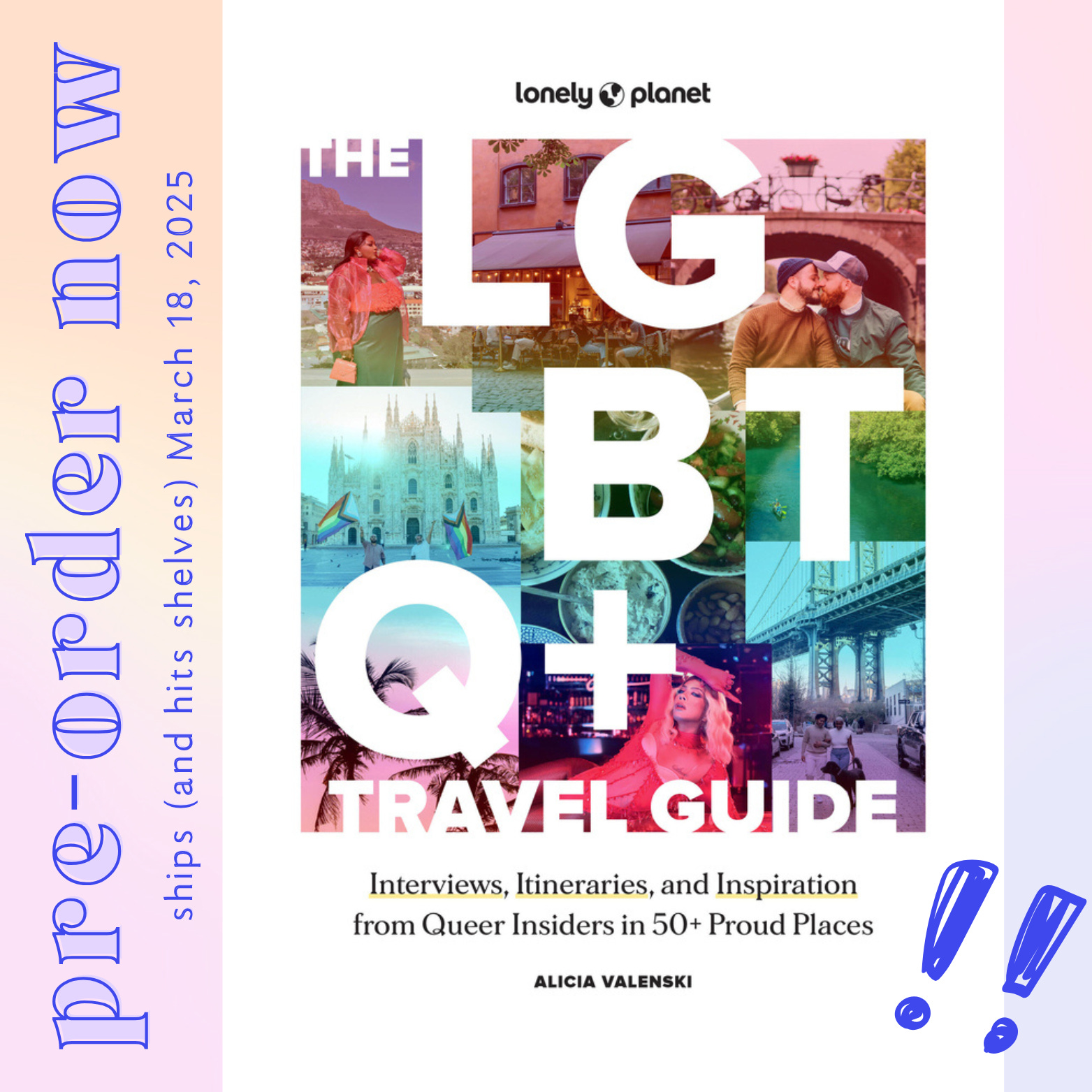
In early August, Emily let us know that the sales and marketing team voted, and we had a winner! The team agreed that their chosen cover design was the most impactful, aligned with market and audience goals, and best communicated the subject matter. Unless we had any concerns, Emily said, we’d move forward with this cover and she’d work on some different versions of the image collage to make sure we get the right mix of people and places.
How it’s going: Unveiling the official cover design
Finally, on August 30—about three months after our cover design journey began—Becca and Emily sent us the official, final version of the cover:

“Here it is!!!!!” Becca wrote. “A stunner. I love how high-end-but-not-snobby it feels—so warm and fun and welcoming but still authoritative.”
“We’ll be embossing the title letters and debossing the image area underneath, along with the subtitle and your name, for an extra tactile and premium feel,” Emily added.
You can now find this winning cover ~*live*~ in all its glory everywhere the book is available for pre-order, including (so far):
Bookshop.org (US)
Bookshop.org (UK)
Amazon (US)
WHSmith (UK)
Paagman (Netherlands)
Standaard Boekhandel (Belgium)
Indigo (Canada)
Books-A-Million (US)
Loyalty Bookstore (US)
Constant Reader (Australia)
Amazon (Germany)
Platekompaniet (Norway)
William Dam Boghandel (Denmark)
All the cover designs we didn’t go with (and why)
In case you weren’t keeping count as you read through the design process, Emily prepared a whopping eleven concepts for our review before we arrived at the winning cover—and given all of the hard work she put into them (and how talented she is at what she does!) it would be a pity if no one outside else ever got to see them.
So for anyone who wants a sneak peek, here are the concepts Emily shared with us during during each round mentioned above, along with the context she provided us and the feedback we shared with her after reviewing each one.
Round 1
Context from Emily:
A straightforward layout that relies on two images to draw you in and explain the concept. Images will need to show the diversity of the contributors and locations. Simple and clean.
More design-forward with the large title letters creating a dynamic composition that moves your eye around the cover. This concept hinges on a great single image that quickly gets across “travel to inviting and vibrant destinations.”
Dominant and eye-catching title/subtitle would be the first read when seeing the cover. A handful of cutout images that when shown together would encompass the variety of subject matter inside—contributors, places, sights, tastes, etc.
Keep reading with a 7-day free trial
Subscribe to Carry On to keep reading this post and get 7 days of free access to the full post archives.